
0800HELPME
A membership website built for the worst moment of someone’s day
- Web design
- Memberships
- Web development
Overview
A service nobody has heard of, sold before it is needed
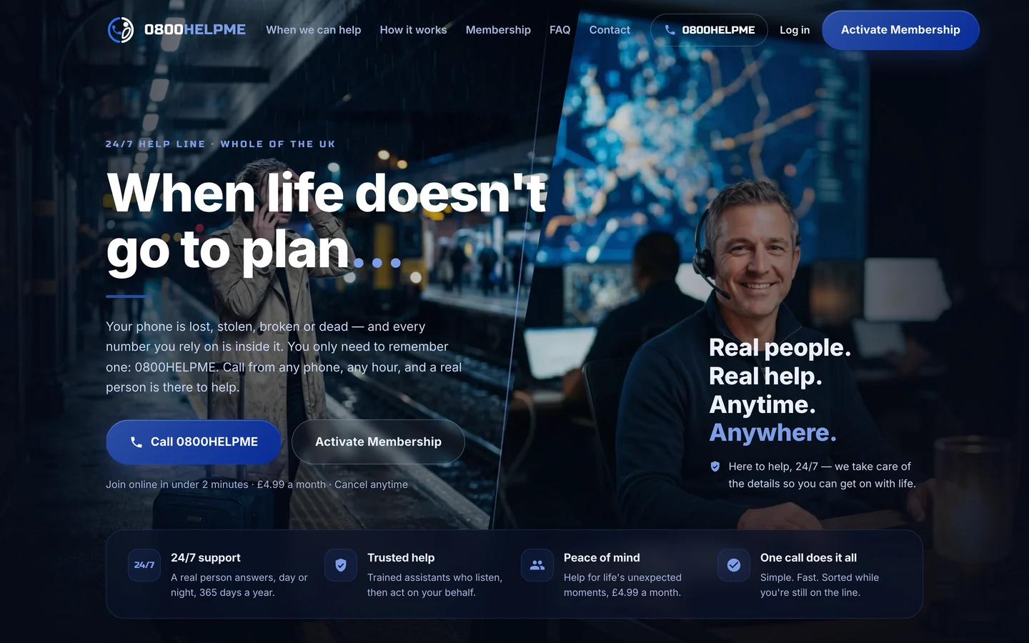
0800HELPME is a 24 hour help line. Lose your phone, your wallet or your keys, or get stranded somewhere with a dying battery, and one call reaches a trained assistant who does the legwork while you stay on the line. It is a membership rather than a one off purchase, so the site had two jobs: explain a service most people have never bought before, and sign them up in a couple of minutes.
Most things people buy online solve a problem they already have. This one is the opposite. The value of 0800HELPME only becomes obvious at the moment it is needed, which is exactly when nobody is browsing a website. The site had to make that moment real in advance, without sounding like insurance and without sounding like a call centre script.
The challenge
A new idea with a hard sell
- A service most people have never come across
- The value only becomes obvious in a crisis
- Easy to be mistaken for insurance or a call centre
- Membership means signup, logins and an account area
- Trust is needed before anyone stores personal details
What we built
The moment made real, then made easy to join
- Real situations put first, product explanation second
- What actually happens on the call, step by step
- Signup and member login built into the site
- Plain language about what is stored and why
- Built to work on a borrowed phone, in a hurry
The build
A website that makes the moment real before it sells the membership
This was a web design and build project with a persuasion problem at the front of it and an account system behind it.
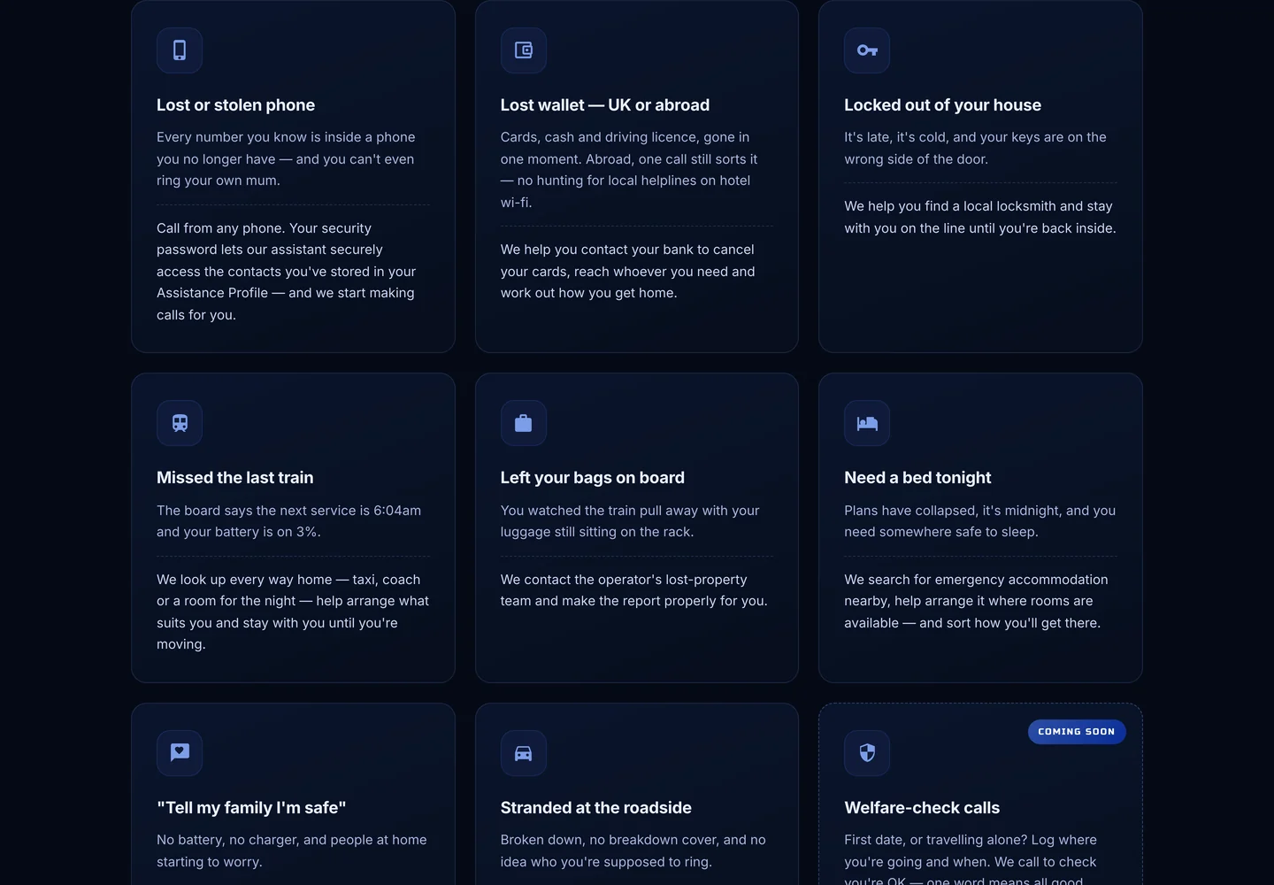
Real situations, not slogans. Lost phone, lost wallet abroad, locked out at midnight, missed the last train, luggage gone with the train. Each one is written as the moment it happens, then answered with exactly what the service does about it.
What actually happens when you call. One number, a security password to verify you from any handset, then a trained assistant doing the legwork and staying on the line. Laying out the sequence answers the question everyone has, which is what am I actually buying.
Membership, signup and logins. Joining happens on the site, and members get their own login and account area. That is the part that turns a marketing page into a working product, and it needed building properly.
The stored profile, explained plainly. The service depends on people storing key numbers and contacts in advance. We explained what is held, who can reach it and how it is used, because nobody hands that over to a page that stays vague.
Built for a borrowed phone. The people who need this most are often on someone else’s handset, in a hurry, on a poor connection. The site is fast, plain and works on whatever they are holding.
Found before the moment arrives. Titles, descriptions and structured data explain a service that has no obvious search term yet, so it can be found by people looking for help of this kind.
The proof
Every situation, answered with what happens next
Rather than a feature list, the site is built around the moments the service exists for. Each one states the problem in the words someone would use, then says exactly what the assistant does about it.
The look
A calm, reassuring look for a stressful moment
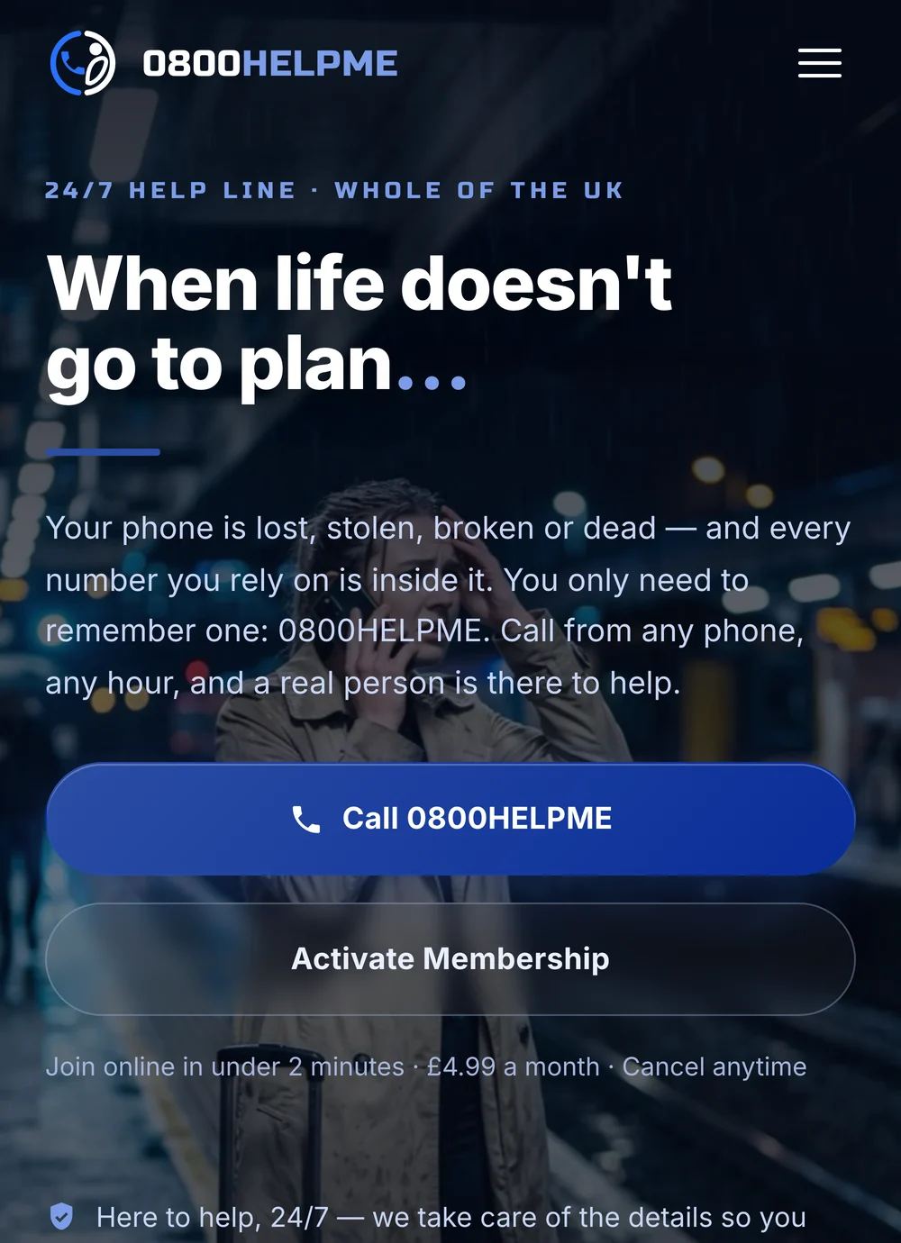
We designed the site on a deep blue canvas with plenty of air and a real person on the phone rather than icons. It needed to feel steady and human, because the emotional job of the page is reassurance, not excitement.
On a phone everything is short, high contrast and easy to act on. Joining takes a couple of minutes and the number to call is never hidden, because a member who needs it should not have to hunt for it.
The membership and account side used the build part of our services, and the site runs on hosting and care we look after so it is up when it is needed.
The process
From brief to live, step by step
We started with the moments the service exists for, and the objection behind each one. The order of the page, the way the call is explained and the wording around stored data all came out of that.
1. Listen. We learned the service, the kinds of call that come in and the questions people ask before joining. The situations on the page are the real ones, in the order they matter.
2. Design and write. We designed the look and wrote every word, from the situations to the FAQs and the wording around stored details. They reviewed it and we refined until it was right.
3. Build and launch. A fast, mobile first site with signup, member logins and the account area built and tested, then launched ready to take members.
Your questions
Membership and subscription websites
Do you build membership and subscription websites?
Yes. The 0800HELPME site in this case study is one of ours, with signup, member logins and an account area built in. The same approach works for clubs, services and anything where people pay monthly and expect their own login.
What makes a good membership website?
Make the value obvious before you ask for the money, especially when the service is unfamiliar. Explain exactly what happens after someone joins. Be plain about what data you hold. And make joining short, because every extra step loses people.
Can members log in and manage their account?
Yes. Members get their own login and account area. What that area holds depends on the service, and we build it around what your members actually need to see and change.
Can you handle payments and recurring billing?
Yes. We build the signup and payment flow to suit the service, including recurring memberships, and keep it as short as it can reasonably be.
How long does a site like this take, and who looks after it?
A membership site takes longer than a brochure site because of the accounts and payments behind it, so expect a few weeks and a proper testing stage. Everything is yours. If you would rather not think about hosting and updates, our website care plans handle all of it.
Designed and built by our Kent team
Helen Marsh, Lead Designer, Kent Web Design
Helen led the design on this project. She designs clean, easy to use websites for small businesses, with a focus on turning visitors into enquiries. Published 16 September 2026.
Want a site
like this?
Tell us about your business and we'll come back the same working day with one fixed price for the whole job.
Prefer to message?
WhatsApp usWhatsApp us on 01622 278991Same-day replies on 01622 278991, Monday to Sunday.
Where this fits
Looking for the same thing for a membership business?
0800HELPME sell UK wide, and a membership needs more than a brochure site: signups, logins and payments that keep working while you sleep. If people pay you monthly, our services page sets out how we build that, and how we look after it afterwards.